Are You SHOUTING or Are You Just Happy to See Me?
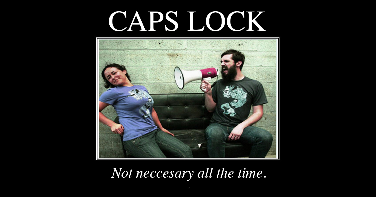
If there is one thing that annoys me most when it comes to computer etiquette, it would have be the use of ALL CAPITAL LETTERS in an e-mail message, comment in a blog or website, and even a text message on my phone.
Not only is it considered shouting, but it is also hard to read and simply annoying. It makes me not even want to read the text because I’ve lost all credibility with the person typing in all caps! It’s as though the person lacks intelligence, is immature, or just plain lazy.
One of the first things I like to teach people new to the wonderful world of computers is e-mail etiquette 101. It describes the proper use of e-mail at the utmost basic level. A majority of which is still ignored today as I notice sifting through my morning e-mails. Poorly formed subject lines (if any), the RE: RE: RE: FWD: FWD: FWD: messages (which is a whole other story), mis-spellings and grammatical errors, replying to an old e-mail with old subject line intact and starting a new subject, and of course the use of all capital letters.
Early computer programs actually had problems reading lowercase letters, so it was the norm many years ago to use all capital letters in computer code. Not so much anymore. In fact, great Code Writers and Web Programmers pride themselves on writing clean code. That is, the programming code is nicely formatted, coding does not contain clutter or useless code, is nicely spaced and easy to read, and does not typically contain all capital letters.
The majority of businesses and companies these days have e-mail and web policies in place for their employees. They are strictly enforced and are not taken lightly as they are a true reflection of the Company’s Image. In my Corporate work experience, I’ve seen many issues arise from the improper use of e-mail communications. Some of which, I have witnessed firsthand and sequestered to Managerial meetings over. Some outcomes did not fare so well, while others, employees were kindly reminded that you just can’t do that in an e-mail. According to this article ![]() , a woman in New Zealand was fired over the use of all caps in an e-mail. She even took it a step forward and changed the color of her text to red! She may have got her point across but lost her job in the process.
, a woman in New Zealand was fired over the use of all caps in an e-mail. She even took it a step forward and changed the color of her text to red! She may have got her point across but lost her job in the process.
 When it comes to Graphic Design, the use of capital letters becomes a whole other world. It is a conscientious decision made by the Designer. An artistic license if you would. Although I may sound like I’m contradicting myself from everything I’ve said above, that can be tossed aside when capital letters are used effectively in a design. The letters of a logo for instance, become a graphical shape and part of an image that signifies a brand. Capital letters are used as a design element rather than to start a shouting match. By using all capital letters in a logo (or other design), there tends to be an innate portrayal of trust and strength with the business.
Take our logo for instance. We made the decision to use all capital letters to signify the importance to our name. The type in GING is bolder than ALLEY and is intended to create a visual balance since there are more letters in Alley. The logo also works on a whole by using a variation of the same font and keeping the type uniform and on the same plane. The tagline below is scaled down and although it too uses all upper case, the importance is less significant and does not draw as much attention to the eye.
On the opposite side, the use of lowercase type can signify a whimsical or softer tone. A good choice for some business logos, but not all. Oftentimes ascending and descending type can play against Designers when using lowercase, so uppercase becomes an advantageous choice.
In conclusion, if you use all caps in a message, please use them sparingly and certainly be conscious of others’ feelings towards them.
I guess you could just say that we’re case-sensitive.